Thursday, December 18, 2008

Carbonite works!

I'm still not sure what I did, but somehow, while I was working on my to-do list (a FileMaker database), I accidentally deleted all of the active task records. Gack! I'm a slave to that database. Without those records, I'm not a freed slave: I'm a slave without a clue what to do.

But did I panic? I did not. I went to http://carbonite.com, logged in, and in two or three seconds I learned how to restore a single file from my Carbonite backup disk. A minute or two later, I had restored last night's backup of the to-do database and I was back in business. I can't really see how it could have been much easier.

I've been using Carbonite for a while. It's cheap ($50 a year) and easy. It has some limitations, of course. It won't backup data on external drives, like the large external drive that I use to store photographs. So I have to use a more complicated system to back up photos. But for the stuff on my computer's internal drive, Carbonite can't be beat.

Wednesday, November 19, 2008

The compact camera I would buy today if I had any money: Panasonic Lumix DMC-LX3K

Of course there's no such thing as an absolute best compact camera, but for my own needs these days, if I were buying a compact, this may be the one I'd get: Panasonic Lumix DMC-LX3K. I've heard rumors about it coming - PopPhoto.com had a preview of this camera back in July - and I just became aware that it's out by reading an actual review in the dead-trees edition of Pop Photography (October 2008) that was extremely positive. Here's a link to the summary page of the review on DPReview.com, where the camera is given a "highly recommended" rating and compared favorably (in most respects) to the Canon PowerShot G10 and the Nikon Coolpix P6000. And here's a link to the Amazon.com product page where it has a 5-star rating based on 14 consumer reviews - a pretty remarkable achievement. And the reviews are interesting. A number of them are from DSLR users who sound like serious photographers.

The camera's not perfect. Two problems mentioned in the reviews that would make me hesitate are, first, handling is a bit awkward for folks like me with biggish hands; and second, its raw files aren't supported by Adobe. The latter problem sounds like something that will be fixed sooner or later - probably sooner, especially given the reviews the camera's getting. As for the handling, well, I guess I'd want to get to a bricks-and-mortar store and handle one to see how it feels.

Still, there are some real strengths to offset those disadvantages. Like the sensor on my Pentax K20D, the sensor in the DMC-LX3K has been reengineered so that the photosites themselves are larger, and that helps reduce noise. And there's that lens! It's a 24-60mm (35mm equivalent) f/2-f/2.8 Leica DC Vario-Summicron. These are impressive specs. Digital SLRs typically come with kit lens that only go as wide as 28mm (35mm equivalent). This is one of the reasons I really love my Pentax 16-45mm f/4 lens: On a Pentax DSLR, that 16mm wide angle = 24mm field of view. Well, the Lumix DMC-LX3K has that same 24mm FOV. And while my Pentax 16-45 only goes to f/4, the DMC-LX3K goes to f/2 (!) wide open, and can get to f/2.8 at 60mm. Impressive. It's funny how things change, well, at least for me. When I got back into photography a little before we went to China, what I really wanted was long telephoto reach, so I could shoot birds and such. These days, I'm willing to trade long for wide.

While some would disagree, I would also count it as an advantage that the DMC-LX3 has "only" 10 MP. Sheesh, 10 MP is plenty for a compact camera! There's no point in increasing resolution unless you're really getting something in return. The lenses on most compact cameras can't provide resolution that matches the sensors already. So if you're using a Canon G10 or a Nikon P6000 (14 and 12 MP respectively) there's a good chance you're getting nothing in return for filling up your hard disk faster.

Anyway, 24-60mm (35mm equivalent) f/2-f/2.8 lens sounds wonderful. If you really need a digital SLR, well, this isn't a digital SLR. But if you don't need a DSLR but want to take outstanding photos or people or landscapes, or if you already have a DSLR and just want a really good compact camera to carry around when your DSLR would be too big, then the Panasonic Lumix DMC-LX3K sounds terrific. There's a new compact camera on the market almost every week. This one however seems a bit different.

Friday, November 14, 2008

Followup re TooDo on Android

I was delighted this morning to find an email in my inbox from Edouard Mercier, the smart programmer who created TooDo, the powerful task management app for Android that I mentioned (and criticized) in yesterday's post. I was delighted to hear from him, because it's clear that he really wants to make TooDo better. I have offered a few more of my own personal suggestions for him to consider, and I may have the pleasure of speaking with him sometime soon. I want to say again, what Edouard has done in TooDo is, strictly from a programming and design perspective, very impressive. True, I think the app is too complicated, but it's very ambitious. I would really like to have a good to-do list program on Android that syncs with a good program online. I hope that Edouard's efforts will improve TooDo. It still won't be for everybody. Many people only need a very simple list tool. But for those of us who need something more powerful and more flexible, well, while I like Tag ToDo very much, I would love TooDo if it can just get a little quicker, a little more stable and a good bit easier to navigate.

Edouard also corrected a mistake that I made in the post. I said that TooDo automatically senses your context. Not so. There's a simple "Change Context" button in TooDo's menu that you can use whenever you want to few tasks for a different context - but it's manual, not automatic. I was also playing with Locale last night and I must have gotten TooDo and Locale confused as I was posting late at night. Locale will automatically sense that you've left home and turn on or off certain settings on the phone automatically. I am grateful to Edouard for the correction and for his continuing hard work on TooDo.

To-do list options for the T-Mobile G1 (Android OS)

I've found a couple of to-do lists for the Android OS.

First, I tried TooDo from Edouard Mercier. This was my first choice because it claims to be able to sync tasks with the excellent and very powerful online to-do manager, Toodledo, which I've been using for about a year now. (It also syncs with Remember the Milk, another popular online task management service that I have never used.) In addition to syncing with Toodledo, TooDo has some other rather impressive features, including the ability to detemine context automatically, I guess by using GPS. (Contexts are places you need to be do do certain things. "Pick up laundry" is a task that might make the most sense if your context is "Driving," while "Ask boss for raise" is something you'd do in the context of work.) Unfortunately, TooDo has some serious problems that, for me, make it just about unusable in its current form. I'm very impressed with the programming that must have gone into it. But it's too complicated. To make all the options for every task editable on the G1's tiny screen, TooDo has to use a very cluttered GUI, with icons and buttons whose purpose I have yet to figure out. It reminds me of one of those brilliant Windows apps with totally idiosyncratic GUIs that Mac users used to laugh at. The other problem with TooDo is that it doesn't appear to be stable. It keeps quitting on me, no doubt because syncing with Toodledo is difficult. I only use TooDo when I'm at home with a wi-fi connection, so I don't think this ought to occur. No other app I have on the G1 at the moment has quit on me as many times as TooDo. Still, the instability is an issue that I can be patient with, if the program works well otherwise. But as I said, TooDo is, in my own opinion, too complicated for a mobile device. But do check it out for yourself. There's nothing else as powerful for Android at the moment (as far as I am aware), and you may find that you love it. It has good ratings in the Android Market.

There are a couple other apps for Android that have the opposite problem: They are, if anything, too simple.

ToDoList is about as simple as it can get. The menu offers just one button: add task. Tasks can be given only one property, a simple name or description ("deposit check at bank"). Tasks are displayed in a simple bulleted list, showing the task description and, in smaller text, info about when the task was created. You can't sort the list and as far as I can tell you can't search it. Slow-touch a task and you get the option to cross it off or delete it. That's the app in toto. Fine for quick lists, or for a simple grocery list, but not good for anything even slightly ambitious.

QuickList is another simple app, although it does a good bit more than ToDoList. For starters, QuickList allows you to enter a task either from the keyboard or by using your finger to write on the screen. By "write," I really mean "draw." There's no text recognition going on here. But the GUI for writing on the screen is pretty well done. (Here's a video review on YouTube.) You're given most of the screen to write on, which is important because your trying to write with your finger, which turns out to be a pretty clumsy writing instrument. Of course, the scribble input option would be entirely unnecessary if Android provided a virtual keyboard. QuickList also lets you assign new tasks to colored labels. This is what makes QuickList much more useful than ToDoList. QuickList gives you five different labels to work with, and you can give them names of your own (for example, Work, Home, Shopping). You can then view the tasks for one label, or two labels, or all labels. This is a pretty basic organizational structure but it works well. It's a simple feature set, but even this little bit of organization makes QuickList much more useful than ToDoList.

Finally, I found what seems to be the nearly perfect to-do list for Android: Tag ToDo by Teodor Filimon. In Tag ToDo, tasks are organized by tags. As an organizational tool, tags are similar to labels in QuickList, but definitely not the same. For one thing, tags are just text, without colors. I have created tags for Personal and Work to start with and I'll probably add more later. There's an Add Tag command in the Menu and it looks like you can have as many tags as you like. Another difference between tags and labels is that, in Tag ToDo, you only see one tag's tasks on screen at a time. At the top of the screen there's a selection menu (the programmer calls it a "spinner") that you use to select the tag whose items you want to view. So tags, in a sense, are separate to-do lists. While you're viewing a tag and its items, Tag ToDo will give you some basic stats: a count of uncompleted tasks in the current tag and in the entire app. My only complaint about the way tags work with items is that, once you've created an item within a certain tag, you can't change the tag assignment. If you put a to-do item in the wrong tag, you'll have to delete it under its current tag and recreate it under the correct new tag. (Tip: copy the wrongly tagged task's description, switch to the right tag, make a new empty task and paste into a new task description. Don't forget to go back to the old task now and delete it!)

I've been speaking mainly about the way that tags work, but Tag ToDo has some nice features that are tied to individual to-do items. The most notable is the ability to attach a graphical note - a little sketch, for example, a simple map - to a task. My gripe here is that, when you view tasks in a list, there's no way to tell which tasks have graphical notes and which don't. Another nice feature in Tag ToDo is the ability to move tasks up and down. Well, this is done a bit crudely. The "push down" command actually doesn't push a task down, it pushes it to the bottom of the list. Still, it's more than you can do in ToDoList or QuickList, and it's quite useful.

So that's four different to-do list apps for Android, ranging from the extremely powerful and complicated (TooDo) to the absurdly simple (ToDoList) with a couple apps in the middle (QuickList and Tag ToDo). My strong preference is for Tag ToDo. It's not perfect, but it's pretty close to a model Android app, both in the way it takes advantage of Android's standard UI devices, and in the way it strikes a very nice balance between utility and ease of use.

Tuesday, November 11, 2008

Integrated Gmail - more about why open source rocks

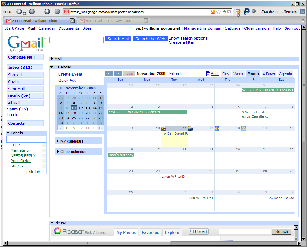
Earlier today I was reading an article about add-ons for Firefox that mentioned something called Integrated Gmail. After visiting the web page for the Integrated Gmail add-on (here), I downloaded it and gave it a try. It's quite nice.


With the add-on installed and configured, I'm able to get access to my mail, Google calendar, and Picasa, all on the same web page. In the screen shot above, notice that I've hidden my mail away and I'm displaying the calendar (in month view); you can also see just the top of my Picasa Web Albums home screen, as well. Integrated Gmail has a number of other options, allowing you to view Google Notebooks and more. It's easy to configure.

It's not a huge deal, I admit. I'm pretty used to opening calendar and Picasa Web Albums in separate tabs. But I particularly appreciate closer integration of mail and calendar in Gmail. NOTE that this works only on the computer - not on my T-Mobile G1.

What I find particularly interesting about this is that it's possible at all. It is possible because Firefox is an open-source browser and because Google provides programmers with the inside info they need (an "API" or application programming interface) to write code that modifies or extends Google's own online applications. The closed approach to software development taken by Apple yields some good results, and a more open environment does produce a lot of garbage. Nevertheless, I prefer the open model and I think it's better for the world of computing in the long run.

Sunday, November 09, 2008

Android talks my language

I was pleased yesterday to discover that many common abbreviations (I've, can't, won't, they're and many others) can be typed in Android without the apostrophe: when you hit the space key, Android adds the apostrophe for you.

But I was really tickled this afternoon when I discovered that one of the abbreviations Android expands automatically is y'all. Very cool!

T-Mobile G1 + Google Android = Something Close to Happiness

I have been reluctant to move to a "smart phone". I am not eager to do a lot of typing on a teeny keyboard, so I am not eager to use a phone for email. I also dislike the idea of being "in touch" 24/7. And I did not want to be tied to a specific email service. For these reasons, I was never attracted to the Blackberry. I liked the Apple iPhone much more. But the iPhone has been too expensive, and I've been tied into a contract with T-Mobile while the iPhone requires service from AT&T. (I know the iPhone can be hacked to work with other providers. Let's just say that, as a software developer myself, I respect Apple's right to set its own terms of use and do not wish to violate those terms.)

But as time has passed, I have felt the desire, if not the need, to be able to access the Internet when I'm away from my computer - to get directions, or to check my email. I've been watching reports about Google's Android mobile phone operating system, and when the first Android phone - T-Mobile's G1 - was released, I checked it out, liked what I saw, and decided to give it a try. After two weeks of use, I've come to like it very much and I'm going to keep it. What follows may look like a review but it isn't. I don't pretend to be comprehensive here. If you want to read more, try this short review at Engadget or this long and very thorough review by Matthew Miller over at C|Net. I'm just offering a few general - and generally positive - thoughts about the G1 and Android, for what it's worth.


The G1 hardware

As a piece of hardware, the G1 isn't perfect, but it's very good. True, it's not quite as sleek and sexy as Apple's iPhone, but it's pretty attractive - compared, say, to Microsoft's Zune, the G1 is a super-model. My thirteen-year old daughter thinks the G1 is very cool, and she especially likes the way it opens to reveal a keyboard, so it passes the thirteen-year old "what's cool" test. And as a grown up, I am aware that looks aren't everything.

The iPhone's minimalist hardware design reflects Apple CEO Steve Jobs's personal devotion to the KISS principle. Apple has never released a a multi-button mouse. Like the Mighty Mouse or the iPod, the iPhone gives users a single hardware control and makes it work very hard. I grant that it's brilliantly done - but ultimately, a slightly more complex hardware design would serve users better. The G1 has six hardware buttons, one of which is also a track-ball. The presence of multiple hardware buttons has the same benefit on a phone as on a camera. Serious digital SLRs like my Pentax K20D have buttons on the body that give the photographer one-touch access to functions that, on "easier" cameras, are buried in menus or accessible only through non-obvious shortcuts. In the same way, the G1's buttons make the phone easy to use.

The keyboard is pretty well designed, too. Many reviewers of the G1 who are also familiar with the iPhone have opined that a hardware keyboard allows for faster, more accurate text input than Apple's virtual keyboard. I'm not entirely sure about that. I have only a little experience with it but the iPhone's virtual keyboard does seem very well designed and, judging from this YouTube video, an experienced user can indeed input text quickly and accurately on the iPhone. But I'm pretty sure that the G1's hardware keyboard is not worse than the iPhone's virtual one and I suspect that, if you want to type a lot and especially if you want to type with correct punctuation, the G1's keyboard is a bit more efficient. And the G1 has an advantage in another respect. While at first, a "closed" G1 looks like its display is smaller than the iPhone's, when you flip out the G1's keyboard, the G1 actually seems to have the advantage, because 100% of the G1's display is still used for display, while a good portion of the iPhone's is taken up with the virtual keyboard. I do want to add that I wish that Android provided a simple virtual keyboard that could be quickly accessed when the phone is not flipped open. There are times when I would like to type just a few letters or numbers, and it would be nice to be able to do so without having to flip open the phone and change its orientation. Perhaps that will be added in a future release of the OS. There's no chance, on the other hand, that your iPhone will get a software update that gives you a physical keyboard.

I have two gripes about the hardware and both have already been voiced by most reviwer's. First, the phone's "chin" seems to get in your way on the right side as you type. But I'm getting used to it. Second, I wish I could plug in earphone's while the phone is being recharged, but I can't.

I should add a comment about battery life. Like many new users, I noticed that the phone's battery seemed to deplete very quickly. But I have learned how to reduce the draw upon the battery (for instance, by turning off GPS satellite use) and by letting the battery run down completely before recharging I've been able to get a longer-lasting charge.

Finally, I find that the G1 works pretty well as a phone. When I'm within range of a wi-fi hotspot, I can use wi-fi for my phone connection, which seems to improve reception and also saves me money by not counting against my minutes. My older T-Mobile phone never worked well at home. The G1 does work fine here, because it's getting its signal from our home network, which provides a pretty strong signal. I am starting to use the G1 for work from my home office in preference to using Skype, which has had numerous problems of its own.


Android, Google's mobile phone operating system

As for the Android OS, I like it a lot. Not surprisingly, it is well suited to users like me who already rely heavily on Google's various online apps, especially Gmail and the Google calendar. I do hope that future versions of Android provide better support for Picasa Web Albums and Google Docs and Spreadsheets.

The Android GUI is attractive and generally easy to use. It took me about 1 minute to set up the phone initially: I simply provided the username and password for one of my Google accounts and I was off to the races. The built-in apps for Gmail and Google calendar work pretty well. Unfortunately, they are tied to a single Google account. If like me, you have several accounts, well, that's a problem. You could have messages from the other accounts forwarded to the account you use on the G1, but as far as I can tell, you can't select different FROM accounts when you send mail in the G1's Gmail application, the way you can when you access Gmail on your computer. I use my william-porter.net account as my primary account now, and I access my software business account (polytrope.com) and my old personal Gmail account using the G1's web browser. It's a little more awkward to get email using the browser, but it's also possible to do certain things that can't be done in the Gmail app, like edit the quoted text to delete unnecessary stuff.

I could say a lot more about my experience with the user interface and the various apps that I've come to use, but I simply want to note that what I like most about Android is its configurability or openness. It's quite easy to put your favorite shortcuts on the G1's three-panel desktop. I'm able to call my wife, or get into my bank's web site, or see today's calendar, with a single touch of the phone. If I'm lost on the road, a single touch turns on the GPS satellite (for the most accurate positioning), another touch opens Google Maps and a quick third touch tells me where the hell I am.

The Android Marketplace is full of free apps that can be downloaded to the phone. I've downloaded a pretty decent free dictionary (Free Dictionary Org), a shortcut-making app (AnyCut) that gives me a lot of options for configuring the way I use the phone, an amazingly capable photo editing app (PicSay) that lets me edit photos taken with the phone's amazingly capable 3 MP camera, a simple notepad (OI Notepad), and an app that lets me manage my ToodleDo tasks on the phone (TooDo). I've even downloaded a few songs from Amazon.com's MP3 market. Price is the same per song as Apple's iTunes Music Store, but the songs come without DRM limitations, which I'm pleased about. I'm going to download a utility that lets me take a riff from a Tom Petty song and turn it into my own ringtone. Neat. (I could do the same thing with the C# fugue from Book 1 of the Well-Tempered Clavier but I respect Bach too much to use music I myself have performed in public for a ringtone. I hope Tom Petty won't take this personally.) The one thing that seems to be missing from the Android Marketplace is a database app. Maybe I should get the Android API and see if I could write one myself, but I'll probably just wait for somebody smarter to do it for me. The way new apps are appearing for Android, I don't think I will have to wait long.


It's not an iPhone - but that's the point

As I confessed at the start of this post, I never bought into the iPhone thing, so I am not handicapped by comparisons to the iPhone. What I gather from the reviews of the G1 that I've read is that the G1 is not as mature as the iPhone but that it's already off to a better start than the first iPhone. But what matters more to me is that the G1 and Android are taking a completely different path from the one that Apple has chosen. In this, Google shows how much smarter it is than Microsoft, which generally seems to imitate Apple without being aware that Microsoft can never be Apple, just as a 800 lb gorilla can never be a gazelle. Google knows what it's good at, though. It's good at offering apps and services that aren't locked into anybody's specific platform. By making Android an open-source project, Google has produced something that might almost be called an anti-OS. Microsoft looks increasingly irrelevant.

*

Postscript: I've just learned that a virtual keyboard is on the road map for future Android development and should be part of a Q1 2009 upgrade to the OS. Cool.

Saturday, November 08, 2008

Quick note about typing on the G1 phone

I find the keyboard on the T-Mobile G1 "smart phone" a tad awkward to use. After all, I am a 110+ wpm touch typist when I can use all 10 of my fingers. Typing with my thumbs is frustratingly slow. But I am getting a little more comfortable with the keyboard every day and already I am able to type faster than I expected to be able to, and I make fewer mistakes than I thought I would. 

I think it's better to have a full QWERTY keyboard than to have to type with just the normal dialing pad pad of a phone, where, to type the letter "c" you must hit the "2" key three times! And although I have never typed more than a few words on an iPhone, I think I prefer to have a "real" keyboard rather than a virtual one. I read a statistic a month or two ago that noted that iPhone users account for a disproportionately high percentage of mobile access to the Web - and for a disproportionately low percentage of text messages; the explanation offered was that the iPhone is great for browsing and reading but not so great for typing. I suspect I would feel the same way. On the other hand, there are types when it would be nice to have a virtual keyboard on screen as an option. I have occasionally wished that I could type something simple like a phone number without having to open up the phone to get to the keyboard. 

I really wish Android had a utility to auto-expand typed shortcuts, like As-U-Type on the PC or TypeIt4Me on the Mac. It would be a huge help on the small keyboard. The underlying technology seems to be there, because Android already can turn a lone "i" into a capital "I" and can turn two spaces in a row into a period and a space. So the OS is already monitoring keystrokes and can be asked to back up and make quick corrections. Now somebody just needs to figure out how to extend that capability to the "correction" of a user-configurable list of shortcuts, so I could type "tm" and have the phone auto-correct that to "T-Mobile" and so on.

One thing that I love about the way Android handles text entry is the ease with which you can enter accented characters. To type the accented é in "idée" or the enya in "piñon", you simply type the letter and hold it down for half a sec, then select the option you want: è or é or ê or ë. An excellent typist using a Mac can probably enter accented characters even more quickly. But the Mac OS method involves modifier keys and would be hard to implement on the G1. Android's method is certainly a spectacular improvement over what you must do on a PC! I gather that the Apple iPhone uses the same UI trick to enter accents. If Google swiped the idea from Apple, then I have to give Google credit for recognizing a good thing.

Another nice thing about Android's text handling is that you can cut, copy and paste text.

Don't think I'm going to be typing any lengthy epistles on the G1. But for short messages, it's surprisingly satisfactory.

First post from my phone

Here's a pic of my daughter and her friend. This message was written in Gmail on my T-Mobile G1 and automatically posted by email. This must be how Instapundit does it - and now I understand why he keeps his posts short. My thumbs are getting sore!

Do you dare hike to the bottom of the Grand Canyon?

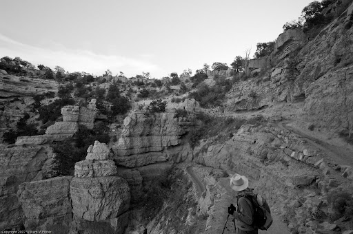
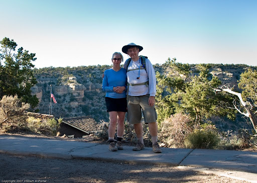
Just got back from a wonderful trip with my wife to the Grand Canyon. We arrived on Friday, October 31, 2008. Hiked down the South Kaibab trail to the river on Saturday, spent two nights camping at the bottom of the canyon, then hiked back up the Bright Angel trail on Monday, November 3. When we did this together over a decade ago, we hiked down one day, and back up the next. This time, we spent two nights at the bottom, although on our "day off" at the bottom, we took two hikes for a total of five or six miles.

This is a short note about our experience for the benefit of anybody else who might be considering such a trip. I'm writing especially for folks who have never done a big hike like this, and most especially for other middle-aged folks. Folks who do this sort of thing all the time and already know what they're doing don't need to read this, because they're the source of most of the info I'm passing on here.


The way up is not the same as the way down
Hiking to the bottom of the Grand Canyon and back is a pretty serious physical challenge. And it's an unusual hiking challenge, in that, most of the time, when you visit a state or national park and go hiking, you go up first, and then down, but in the Grand Canyon, you go down first and it seems deceptively easy. But then you have to get yourself back up and the challenge may be a bit of a surprise.

We used the two most commonly used trails from the South Rim: the South Kaibab to go down, and the Bright Angel to go back up. There are many other trails in the park, but these are the two that leave from the South Rim and take the hiker to the bridges that cross the river to the Phantom Ranch bunkhouse and the Bright Angel campground, where you will be spending at least one night unless you're crazy. The average walking distance of these trails is about 8 miles, and as you walk, you experience a change in altitude of nearly 5000 feet, almost a full mile down or up. How high is that? Well, the Empire State Building in New York City is about 1400 feet tall, to the top of the tower, so you could fit three Empire State Buildings into the canyon, one on top of the other, and you still wouldn't quite make it to the South Rim. But don't let that scare you too much. Hiking the trails in the Grand Canyon is not quite like walking up several hundred flights of stairs. The trails are steep at times, but overall, they're not as steep as the stairs in an office building.

The general practice seems to be to take the South Kaibab down, and the Bright Angel up, which is what we did. I used to think that this was because the South Kaibab is the harder, steeper trail, but I was set straight on that by an expert hiker that we met on our way down. He pointed out that the Bright Angel does indeed have a number of places that are pretty easy hiking, where the incline is pretty shallow. But precisely because of that, the other parts of the Bright Angel are more challenging than they would be if the trail had a consistent incline the whole way. And the most difficult part of the Bright Angel trail is at the top, which means that, if you're coming up from the river, you'll be doing the hardest part of the hike at a point when you're most tired. 

I would note also that descending presents some challenges that climbing doesn't. As you descend on the South Kaibab, you inevitably find yourself dropping heavily from one step on the trail to another, and all this can be pretty hard on your legs and knees. On the way down, we met an Australian couple who seemed to be savvy hikers. They were coming up the South Kaibab. The fellow said that he finds ascending easier than descending. Might be something to that.

Still, the usual practice (Kaibab down, Angel up) has other things to recommend it. 

At the time of our trip (first week of November) there was no water at all on the South Kaibab trail between the South Rim and the river. Two compost-toilet rest stops, but no water. The Bright Angel trail has (if I recall correctly) four rest stops (Pipe Creek beach, Indian Gardens, Three Mile and One-and-a-Half Mile) and there is water available about midway through the hike up, at Indian Gardens. We drank more water going up than going down. If we had decided to hike up South Kaibab, we would either have had to do with less water (not good - see below) or carry more water from the start (and water is heavy).

Another point in favor of the usual practice is that the South Kaibab tends to keep you walking along the ridges, rather than at the bottom of the canyons, and as a result, the views as you go down are more open. I don't want to say that the views on the South Kaibab are better than those on the Bright Angel trail, because if the view from the top were simply better, then heck, you could stay on the South Rim and skip the hike completely. But it's easier to appreciate the views on the South Kaibab when you're walking down and facing the views. Walking up the Bright Angel, it makes less of a direction which way you are looking.

One final point. There's no rule that says you have to take one path down and the other path back up. You could use the same trail both ways. But the views are quite different on the two trails, and it's really worth taking both trails just for the difference in views.

Smart hiking
When my wife and I made the same trek twelve years ago (when I was in my forties and not yet even joking about being an old man), I didn't do so well. I found the hike pretty challenging. My knees started to hurt pretty badly on the way down. And I was not in a great mood on the way up. Part of that had to do with the fact that, when we did this twelve years ago, somewhere a few miles from the summit on the way up, we ran into swarms of gnats that were very annoying. I finally put the netting part of the inside of my lightweight jacket over my head and got some relief, although I suppose I looked like an idiot, hiking up with my jacket covering my head. But even apart from the gnats, I wasn't in a great mood back then.

This time, I was in a good mood all the way down and all the way up. To be honest, I didn't expect that. I told myself beforehand that I expected to be miserable coming up and I was simply prepared to deal with the misery when it came. But I was never miserable, in fact, I was happy all the way down and up and had a smile on my face much of the time. I really enjoyed the hikes. How could this be? After all, I'm twelve years older and, um, twelve years heavier. And I'm prettier sure I'm not in better shape than I was back then.

I think the main difference is that we hiked smart this time. Well, my wife was pretty smart last time, drinking lots of water. She kept urging lots of water on me, and I accept her recollection that I refused it. I probably declined to drink as much water as I should have back then because I was afraid it would make me pee. I needn't have worried. 

I think there are several factors that made this experience a good one, and I recommend other inexperienced hikers to take these things to heart.

First, carry lots of water with you and drink it. When we left the South Rim to go down, I had about a half gallon of water with me: my Deuter hiker's bladder (similar to a Camelbak) was full and so was my Nalgene bottle. I gave away about 10 oz to another hiker who had run out of water near the bottom of the trek, and I still had a little water left in my Deuter bladder when we reached the bottom - but not much. On the way up, I started out with the same amount of water (half a gallon or so), and I refilled my hiking bladder and my bottle at Indian Gardens, half way up. When I reached the top, my bottle was empty but the Deuter bladder had at least a cup or cup and a half left. I would guess that, on the way up, I drank about three-quarters of a gallon of water. Note that we were hiking in early November. The sun was unrelenting on the way dow - there's almost no shade on a lot of the South Kaibab trail - but the temps were not higher than the middle or high 80s (Fahrenheit). In the warmer months, more water would be important.

Second, we supplemented the water with electrolytes. We put electrolyte powder into our Nalgene bottles, which makes the water into a kind of Gatorade substitute. We didn't put it into our hiking bladders because we were told the plastic in the bladders is more likely to retain the taste of the powder and that this might not be pleasant in the future.  So, in addition to drinking water with electrolyte powder mixed in, we ate electrolyte "gel shots" from time to time. I thought that the liquid packages (you suck the stuff out) were nasty, but the shots that came in cubes were reasonably tasty. You consume a shot then drink some water to wash it down.

Third, we paced ourselves prudently, that is, we pushed ourselves a little but not too hard. I generally felt that I was moving at a pace that took some effort but which I could sustain. There were places where I was breathing hard, but I never had to stop because I was completely breathless. 


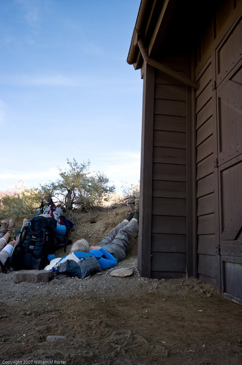
Fourth, we stopped from time to time and elevated our legs. I don't remember doing this twelve years ago and I am sure it helped this time. We wanted to stop every hour and put our legs up for 10 minutes. We didn't stop quite that often but we did stop and put up our legs several times on the way down, and several times on the way up. The key here isn't simply stopping but putting your legs up as high over your head as you can. Really seems to help. I stopped fairly often to take photographs, as well, although I don't count these as rest stops, because I did not usually spend terribly long setting up the shot and taking it. Still, even a one-minute pause probably has some small benefit.

Fifth, we ate and snacked as we hiked. We stopped for lunch on both hikes, but we also snacked a lot - trail mix, apples, etc.

Sixth, we used hiking poles. I think I may have had a single wooden hiking stick twelve years ago, and I'm sure that's better than nothing. But the poles really do help, in a couple of ways. I used the poles, going up and going down, to shift some of the work from my legs to my arms, that is, going up, I'd plant the poles on below a step and then push myself up with my arms. (I found that worked better than putting the poles up first and then pulling, but whatever works for you is what you should do.) The other advantage of the poles is that they reduce the chance of a misstep that might cause you to twist your ankle or even fall. When the path got level, I put up the poles. But most of the time it wasn't level and I had the poles in my hands.

Seventh, as we walked, I made a conscious effort to relax the muscles in my legs whenever possible. I did a little reading about "chi walking" before we left and I adapted some of the principles of chi walking to our hiking. Hard to explain this, so perhaps you should read up a little on your own. It's as much mental as physical, but I am convinced it had some benefit. 

Eighth, my wife and I both had decent hiking shoes, and we wore good hiking socks with sock liners. I saw people hiking in ordinary canvas sneakers and in leather-soled dress shoes and I can't recommend either. On the other hand, I saw a number of experienced hikers wearing old-fashioned ankle-high hiking boots. That's what I wore twelve years ago. I still have those boots, they still fit, and I considered taking them. I think if we had intended to do any scrambling, I would have worn the hiking boots. But we stayed on the trails and I found that my Merrell hiking shoes were lighter and quite satisfactory. Here's a link to a good article that compares hiking shoes with boots, but I recommend that you visit the local outdoor specialist in your area and get help buying a good pair of hiking shoes with the proper fit. Reminds me of the scene in the movie Forrest Gump where Forrest and Bubba first enter camp in Vietnam and meet Lieutenant Dan. Says Lieutenant Dan: "Two standing orders in this platoon. One, take good care of your feet. Two, try not to do anything stupid, like gettin' yourself killed." Good advice for Vietnam and good advice for the Grand Canyon, too. If you think the second piece of advice is superfluous, check out the (thick) book entitled Death in the Canyon. If you're the easily discouraged type, you might want to read it after you complete your hiking adventure.

Ninth, pack as light as possible - but not lighter. We paid to have a mule carry our tent and other camping equipment down and two days later to bring the same stuff back up. That saved us from having to carry 30 lbs down and up. We tried to keep our backpacks as light as we could, but we still each carried a fair load. In addition to my clothes, broad-brimmed but lightweight hiking hat and hiking poles, I carried: half a gallon of water (that's over 4 lbs right there), a lightweight windbreaker, lunch and snacks and electrolyte gel shots, a change of socks, a small amount of medicine, gloves, sunglasses, my wallet, cell phone (don't ask why - it was useless), some hiking maps and pamphlets, toothbrush and razor, a moderately-serious Swiss Army knife, some twine, a small but powerful flashlight and an extra set of batteries for it, a small set of Pentax binoculars, and a head net to use in case of gnat attack. My wife carried a similar load, skipping wallet and cell phone, but adding duct tape, moleskin and a small first aid kit. I also carried my Pentax K20D camera with battery grip and two lenses: a Sigma 10-20 ultrawide and a Sigma 17-70 medium telephoto. Next time, I'll leave the 17-70 at the top of the canyon and just take the ultrawide. If you use a compact fixed-lens camera, you can save yourself a lot of weight. Note that I say, "pack as light as possible but not lighter." For most folks the easiest way to cut weight is by carrying less water. Don't do it! Carry that water. And remember the Boy Scout motto: Be Prepared. The unlikely is not the impossible. And sometimes, emergencies occur. Next time, I think I'll throw an Ace bandage in my pack as well. 

Tenth, and finally, I used modest doses of pain relievers as preventive medicine. I was cautious about this and had talked about it with my doctor beforehand. I'm not generally supposed to take Ibuprofen because I have had some internal bleeding in the (distant) past. I took just one dose of Advil at the start of each hike. On the hike up, in the middle of the hike, I think I took a couple of Tylenol. These pills were perhaps the least important factors in my success. We are thinking of going back next year and, if I can lose a little weight before our next attempt, I may dispense with the pills altogether and see how I fare. Even if you don't take anything prophylactically, I do think it's a prudent thing to carry some normal pain relievers with you on the hike, just in case you do need them.

I should add that I had made a small effort to prepare for the trip by walking more in the months prior to our trip and by occasionally walking up and down stairs in office buildings. I will be honest: the preparation I took doesn't deserve to be called "training." But there's no question that, the fitter you are, the better you'll do.


So, can you hike the Grand Canyon?
Even if you don't feel up to hiking all the way down and all the way back up, I urge you to walk down into the canyon at least a little ways. Even if you only walk down the trail for 15-20 minutes, you'll get a different view of the canyon once you're below the rim than the view you get from up above. It's worth it. 

As for going all the way down and all the way back up, it should be obvious that hiking the Grand Canyon is not for the very old or the very young, or for the disabled, or for those who have medical conditions that make it unwise to take the kind of risks involved in this sort of activity. Do remember that the interior of the Grand Canyon is as close to true wilderness as the Park Service can make it and even with the trails, it's a pretty hostile environment in lots of ways. If you have a heart attack on the trail or break your leg, emergency response time is going to be measured in hours rather than minutes. It's also perhaps not going to appeal to a lot of adults who are normally active back at home but just not up to this particular challenge. If you're a nicotine fiend, or you are really overweight, or you have fallen arches or really weak ankles or you can't stand to be in the sun, or you're really not into walking all day, save yourself some heartache. You can ride a mule down, which eliminates most of the effort, although not all the pain. (Those saddles are not made for comfort.) Or stay at the top and just look.

(Even if you're young, slim, and in really good shape, well, you can still run into problems on the trail, but I'm not talking to you.)

What about the not-so-young or not-in-such-good shape group? I am inclined to think that anybody who is capable of talking a normal walk in the neighborhood of four or five miles and who can walk up and down, say, 10 flights of stairs in an office building, can handle the Grand Canyon, especially if they follow the recommendations I gave above about water, food, weight, pace, rest, etc. And to those recommendations, I would add two more. Be prepared mentally as well as materially. Expect the hikes to be long and hard, then you won't be disturbed or disappointed when you discover that, in fact, they are. And resolve to stay in a good mood and enjoy yourself no matter what happens. You are in one of the most spectacularly beautiful places on the planet. Be happy!

And if you can make it down and back up, well, you will have reason to feel proud of yourself. The ranger down at Phantom Ranch told us that 5 million people visit the Grand Canyon National Park every year, but only one-fifth of one percent of them make it to the bottom and back up.

Wednesday, September 24, 2008

Hooray: Picasa 3 supports Pentax raw files

I just realized that Picasa 3 supports Pentax raw (.PEF) files. Earlier versions of Picasa were able to display the PEF files generated by my Pentax K10D and K20D, but Picasa could not read the EXIF info. Now it can. This is good news. All important photos go through Adobe Lightroom, but this requires some effort, because I have to attach the big hard drive to my laptop. But I take a lot of unimportant photos - lots of test shots, for example, but sometimes just quick shots while I'm working or driving around - and I'd like to look at 'em without having to mount the big drive and launch Lightroom. Now I can just copy those quick shots on to my laptop's internal drive and look at them in Picasa 3, then decide whether to keep 'em or not. Hooray!

Chrome 1 no threat to Firefox 3

I've been using Google's new browser - named "Chrome" - ever since the day it was released a couple of weeks ago. Chrome is cute, but that's about all I can say in its favor. I'm going to stick with Firefox 3 for now.

Firefox is a very mature and capable browser with a terrific feature set; Chrome is an immature application with a very limited feature set. One key difference: Firefox supports themes and add-ons, Chrome doesn't. This is a big deal for me, as I make great use of a number of Firefox themes (today I'm using a theme that makes Firefox look kinda like Chrome!) and add-ons. Ironically, thanks to add-ons, Firefox does a better job of letting me access Google's online applications than Chrome does.
  1. I keep all my bookmarks in Google Bookmarks. There's an add-on for Firefox called GMarks that lets me access my bookmarks in a side panel or via a special Gmarks menu. In Chrome, on the other hand, my only option is to go to the Google Bookmarks web page.
  2. Another add-on for Firefox 3 ("Better Gmail") improves the look and features of the Gmail user interface, which is important because I use Google's Gmail application for all of my mail.
  3. A third Firefox add-on (Surf Canyon) helps me wade through Google's search results more efficiently. 
  4. Finally, I'm using the ScribeFire add-on for Firefox 3 to write this blog post. I find the user interface for Scribe Fire much nicer to use than the web interface for Blogger (which publishes my blog).
In short, Firefox does Google better than Google does.

And I've had some significant problems with Chrome. Although it's supposed to be the fastest browser available right now, it's clear that "fast" has a technical meaning that I don't care that much about. For me, Chrome is not fast, in fact, very often pages seem to load much more slowly in Chrome than in Firefox.

So I'm sticking with Firefox now. Chrome isn't yet in the same league.

Tuesday, July 29, 2008

Lightroom 2 released

Adobe Photoshop Lightroom 2 was released today. It's not earth-shattering news for those of us who have been using the public beta since last spring. But the beta had a few bugs and the final release adds some new features that weren't in the beta. And with today's official release, I can finally combine my old Lightroom 1.x photo collection with the photos I have edited in the last four months using Lightroom 2 beta and which I kept on a separate disk.

Many of the things that were already very good in Lightroom 1 have not changed or have not changed much. The user interface has been tweaked, but is basically the same, and that's a good thing, since they got so much right in the first release. I want to mention just a couple large improvements.
Localized editing with the adjustment brush
First, the localized correction or adjustment brush. I've tried to come up with a better word than "brilliant" to describe this innovation, but I can't. If I actually knew anybody personally at Adobe that it would make sense for me to flatter, I might use the phrase "stroke of genius," but I don't, so I'll stick with brilliant. The adjustment brush provides a way to paint a selection to which you can then apply various local adjustments such as exposure, contrast, sharpening, etc. For example, if the subject was lit from the back and the subject's face ended up being a little underexposed, you could set the adjustment brush to increase exposure, say, half a stop, and then paint on the subject's face. The face would lighten up, but the exposure for the rest of the picture would be unchanged.

Now Light Crafts LightZone has had selection region for a long time, and it looks as if Bibble Pro 5, which I hope is released very soon, will have something like selection regions as well. LightZone's regions have the advantage over Lightroom's adjustment brush in one respect. In LightZone, once you select a region, you can apply to that region any and all of LightZone's tools - exposure, black and white adjustment, blur, sharpening, noise reduction, and more. In Lightroom 2, the adjustment brush can apply a very good selection of tools, including sharpening (which wasn't there in the beta), but it can't apply all the tools. But aside from that, I think I like Lightroom's brush better. Using the brush has the feel of actually dodging and burning in the wet darkroom, in other words, it has a hands-on feeling and also seems less mathematical than a bezier-curve region.

But forget feelings. The real advantage of the brush is in the results. By brushing on a selection area, you produce a selection that doesn't end up looking like it was selected. You can control not only the feathering (possible in LightZone) but also the density of the selection, that is, the degree to which an adjustment is applied (not possible in LightZone, at least not obviously). And the brush has an auto-mask setting that detects edges and limits the brush's application. To return to my example of a face, if the background behind the subject's face is distinct from the face, the brush with auto-mask enabled will automatically figure out where the face ends and the background starts and will apply the adjustments only to the face. Defining a precise region in LightZone was often difficult and sometimes impossible. Finally, although I don't think I'll be copying these adjustments much, it's possible if I want to. The bottom line is, with this one major development, Lightroom 2 makes LightZone, for me anyway, unnecessary.
The gradient tool
The new gradient tool is similar to the brush, except that the effects of the various adjustment tools are applied in a gradient rather than in a simple fashion. This is similar to the conventional gradient neutral density filter that you might stick in front of a lens while photographing a landscape, so you can reduce the dynamic range of the entire scene by decreasing the brightness of the sky without decreasing the brightness of the foreground. Now the gradient tool won't fix a photo if you blew out the sky in the first place. But aside from that, the gradient tool is even better than a filter, for a couple of reasons. It can be applied more precisely: you can apply the gradient just to the left side of your photo, without affecting most of the photo at all. And the gradient tool isn't limited to adjusting the exposure or brightness: it can be used to apply the same half dozen or so tools that the adjustment brush applies, including clarity and sharpness and saturation. Once again, brilliant.

Here's a simple photo:


I don't like to "Photoshop" my photos - to process them in a way that really changes what was there in the first place. But I liked the way the light from outside came from the windows at the far right side of the photo (mostly outside the photo), causing the right side of the photo to be bright and the left side to be dark. Here is the same photo, with the effect simply amplified slightly using the gradient tool. (You can click the photo to view it slightly enlarged.)


It's a small difference but I think it makes the photo. Click here to see an example of the effect applied to a slightly more interesting photo.

"Post-crop vignette"
Lightroom 1 had a vignette correction tool. I think it was designed to help fix the problem that occurs with bad lenses where the edges of the photo are (usually) a bit darker than the center of the photo. The vignette tool in Lightroom 2 has become a real editing tool. You can now apply a vignette to a photo to darken (or lighten) the area around the subject. What makes this really nice is that it is applied to the photo in the same way, even if you crop the photo or change the crop. This is an effect I use sparingly but it's nice to use occasionally, especially with portraits.


(I applied it a bit heavy-handedly to that photo to make the point.) Note that you can apply a negative (well, it's actually a positive number on the slider) vignette, that is, you can just as easily lighten the outside corners. Nice if you want to give a baby a halo.
Etc
I have mentioned three of the most significant improvements in Lightroom 2's Develop module. I want to add that there is much, much more. Sharpening is better and noise reduction seems better, too. I'm especially pleased with the new output sharpening that will apply sharpening differently if the image is being exported for viewing on screen or for printing. My feeling is that colors are better rendered and that auto-white balance works better than it used to. The "auto" exposure correction button in Lightroom 2 has been improved and now seems to produce results that may actually be useful. In Lightroom 1 "auto" almost never produced results that I liked. This was one reason that I liked Bibble 4.10. Bibble's Perfectly Clear feature does a terrific job of fixing the adjustment automatically. I don't think Lightroom is really the right tool for people who don't want to work on their images, but I'm glad to know that the auto tool is there if I'm ever in a super hurry. And there are improvements in the other modules, as well - Library, Slideshow and Printing. I never use Lightroom's slideshow or printing functions, but improvements in keywording and finding images in Lightroom 2 are going to save me time in every session.

The bottom line is that this is a very solid upgrade. I turned to Light Crafts LightZone and more recently to Bibble Labs' Bibble Pro because, as much as I liked Lightroom 1's user interface, it's develop module just wasn't as strong as LightZone (especially when it comes to localized or selective edits) or Bibble Pro. With Noise Ninja built in, Bibble Pro still seems superior when it comes to noise reduction. And I will admit that I'm still really looking forward to the release of Bibble Pro 5, which will have a completely redesigned user interface and selective edits (including, I think, layers!). But for the moment, Lightroom 2 makes it possible for me to stop thinking about LightZone at all. And while I never really missed Photoshop, well, I don't miss it now even more. Even Photoshop gurus like Scott Kelby acknowledge that, with the release of Lightroom 2, they will need to switch to Photoshop even less often than before. Lightroom 2 is that good.

Wednesday, July 09, 2008

Photoshop vs Lightroom

The question of Photoshop vs the alternatives seems to come up in online forums more often these days, especially as the alternatives to Photoshop get more and more sophisticated. The question is often directed specifically at the difference between Photoshop and the program that Adobe very confusingly calls "Photoshop Lightroom". So I've gathered my thoughts on the matter here.

Use Photoshop to make something new

Photoshop is a very old program whose fundamental feature set hasn't changed much in years. It's still basically a pixel editor, except that it has a whole slew of complicated and powerful tricks for messing about with those pixels. You can edit a photo in Photoshop, but that's hardly all that it's good for and if the photographers of the world abandoned Photoshop tomorrow morning, Adobe will still have a market for the program. Photoshop, name notwithstanding, isn't just about photos and has never been. It is widely used for creating business logos, computer program icons and buttons, not to mention free form digital art. I'm not sure how to quantify this but I'd guess half of the features in Photoshop don't have anything to do with photography.

There is probably nothing that can be done with a digital image that can't be done somehow in Photoshop. But that is kind of like saying that there is no phone call that can't be made on a $500 Blackberry or an iPhone. It's true, but beside the point, since the point is not, what can the tool do? but rather, what do you need the tool for? For most photographers, and I dare say even for most pros, Photoshop's feature set is overkill. For processing photos normally, using Photoshop is like using a 747 jet to commute to work.

It makes sense to use Photoshop when the basic data in the photograph is wrong, or to put it a bit less negatively, when you want to make a new digital creation that does not reflect the external reality you capture with your camera. For example, if you want to move the bride's nose around on her face, or fix the groom's bad navy-blue tux so it looks black, or delete a trash can from a photo, or paste open eyes into a group photo in which somebody's eyes were closed - then Photoshop's the tool of choice. If you want to convert photos into photo-based "art," making a photo look like an impressionistic painting, say, or turning the clouds in the sky blue, or giving pigs wings, once again, Photoshop is your tool. But most photographers don't need to do things like that every day, and for that reason, most photographers - including most photographers who are actually making money with their cameras - don't really need Photoshop often or at all.

I know a number of excellent photographers who used to use Photoshop because it was all there was, and who know do all or most of their post-processing in Aperture or Lightroom. I also know photographers who have bumper stickers on their VW micro-buses declaring that you'll have to pry Photoshop from their cold, dead hands. Okay, I exaggerate, but you get the point. Photoshop simply is not indispensable or necessary for normal, even normal advanced post-processing, but many who stick with Photoshop for normal processing think that it is. These folks remind me a bit of the folks who think that you're not a real photographer if you don't use Nikon or Canon equipment. Perhaps if I were doing fashion photography, I'd use Photoshop; I suspect I would. But most of the wedding/event photographers I know do NOT use Photoshop often or at all. It's too expensive, too complicated, too slow, and in many other ways, simply the wrong tool for their (our) needs.

Use Lightroom to process a basically well-taken photo

If the basic raw data in the photograph is correct, in other words, if you actually took the photograph you wanted to take and you simply want now to process it for presentation as well as you can, then you will be better served by another tool. These tools are generally called raw workflow programs, although the genre is now getting kind of confused. The options include:

1. Lightroom (Adobe)
2. Aperture (Apple)
3. Bibble Pro (from Austin-based Bibble Labs)
4. Silkypix Developer Studio (ISL, a Japanese company)
5. LightZone (Light Crafts)

and many others. These programs have their pros and cons and they differ from one another in various ways, but I'm now interested in how they all differ from Photoshop.

First, unlike Photoshop, the five programs above were all designed from the ground up for processing digital photos (raw files) and that's really all they're designed to do. You don't use Lightroom to create a company logo, design buttons for a computer program's user interface, or design a magazine cover.

Second, none of these programs allows you to edit (copy, paste, erase) individual pixels. Note that these programs can all do some things that involve selective editing. All of them (I think) can fix red-eye and can clone/heal a blemish on a photo (for example, bride has a pimple on her cheek). Some of these programs can do much more than that. LightZone has for a long time had a very powerful vector-based tool time that lets you select a region and then apply to that region any of LightZone's tools, without affecting the rest of the image. With LightZone's regions, you can for example give most of the photo a black and white treatment but leave the bride's bouquet in color. In version 2 (due out later in 2008), Adobe Lightroom will have a very different tool (a brush, rather than a vector tool) that nonetheless provides selective editing, and I think Bibble Pro 5 (also due later this year) will have selective editing as well. Note that, while in Photoshop, you work with and change actual pixels, in Lightroom, LightZone, and the other newer raw workflow programs, even selective edits are saved as instructions and do not actually alter pixels in your original file.

Which brings me to the issue of non-destructive editing. Lightroom and the other programs are designed mainly for processing raw files. The raw files themselves are not editable. (They could be, I suppose, but as a practical matter, they aren't.) Adobe likes to use the metaphor of the raw file as a digital negative, which is kind of misleading if you have ever worked in a darkroom, and not very helpful if you have never done anything but digital photography, but is otherwise satisfactory. If the raw file is the negative, then what you use Lightroom (or LightZone or whatever) for is processing the photo for output - like creating a print, although often the output is just a jpeg that you're going to mail to your mother. Anyway, with non-destructive editing, your changes don't effect the original raw file at all. You load a picture, crop it, adjust the white balance, set the black point and perhaps goose the contrast a bit, adjust the exposure a tad to recover highlights, move a color channel's saturation slider a tad to the left to mute the color a bit, apply some noise reduction if necessary and probably a bit of sharpening - yet NONE of these changes are actually made to the original raw file. The edits do (usually) affect the way the photo looks on screen, and the edits are saved in your output, when you export the raw image file as a jpeg, or when you print it.

Lightroom is not "less creative"

I hear it said occasionally that Photoshop is for creative work, with the implication that Lightroom is not. Nonsense.

If photography itself can be creative - I certainly think that it can, even if it's not creative in the same way as music or sculpture - then a great photo that's processed in Lightroom remains a great photo, with all of its creativity intact. I would add that the tools I work with give the editor at the computer the power to push the images a bit further than the camera got them. Lightroom provides tools for wonderful black and white conversions. LightZone has a gaussian blur tool (like the one in Photoshop). Bibble Pro supports plug-ins that can do all kinds of amazing things. So you can certainly complete the creative process in Lightroom or LightZone or Bibble Pro. It's just that your creativity has to be based always on the photograph that was taken. I like to think of Lightroom (or LightZone, or Bibble Pro) as helping the photo achieve its perfection, its end.

Photoshop makes no one a better photographer, but it can make photographs, if not better, than into something rather different from what they were going to be without Photoshop. In Photoshop, you can do any damn thing you want. Occasionally it produces something brilliant, but a lot of what comes from the would-be Photoshop geniuses is self-indulgent garbage.

Lightroom is NOT "less advanced"

And finally, it is a mistake to think that these raw-workflow programs are somehow less advanced than Photoshop. A piano is not less advanced than an organ just because it seems less complex. The five programs I justs mentioned are all very powerful and all involve a steep learning curve. I own and use Lightroom, Bibble Pro and LightZone on a regular basis and there's very little I can't get done with my photos in one of these or the other. I'm looking forward to the release later this year of both Lightroom 2 and Bibble Pro 5. They're both going to be terrific programs. (I'm already using the public beta of Lightroom 2 for most of my work.)

Indeed, I think these programs are in a way more advanced than Photoshop because they have all been built from the get-go with the problem of processing digital captures in mind, and their feature sets and user interfaces address problems that didn't exist when Photoshop was first created. They are all designed for photographers who take a lot of photos, so they all have batch processing features; and most of them also have some terrific digital-asset management capabilities built in. Lightzone is hopeless as a digital asset manager. Bibble Pro has great batch processing tools but isn't so great as an asset management tool - doesn't have the keywording, flagging, etc. features that Lightroom and Aperture have. This may change with Bibble Pro 5, indeed, I hope that it does.

Right tool for the right job

I have nothing against Photoshop. I don't use it, but I have nothing against it. I do occasionally find myself firing up The Gimp, which does much of what Photoshop does as a pixel editor and which costs a lot less (The Gimp is free). And I keep my license for Photoshop Elements current, just in case I feel an irresistible urge to much about with a photo in some what that I can't do with my preferred applications. But I have not yielded to that urge in quite a while.
Thursday, July 03, 2008

Nikon's coming D700 and full-frame frenzy

Over at pentaxforums.com, there's been a lot of chatter about when Pentax is going to release a full-frame body to compete with Nikon and Canon. With Nikon set to release its second full-frame camera very soon (the D700) and at a price (around $3000) that sounds more like a new computer than a new car, this chatter is likely to increase. To some posters, a Pentax full-frame camera seems necessary, as in, "without it, Pentax will die." To others, it seems inevitable, as in, "Pentax will do it just because everybody else is doing it." To a third group, well, the future is harder to read, in part because the advantages of a full-frame sensor are less obvious, especially in the long-run. I'm in this third group.

Which brings me to an excellent article entitled "Is full frame the coming thing?," by Mike Johnston of the Online Photographer, one of my favorite photographic blogs. I recommend the article. It's not often that you get this much honesty and intelligence on the same web page, and for free.

I have only one comment to add. It seems to me that the main advantage of full-frame sensors is that they produce photos that have less digital noise, especially at higher ISOs. Shallower depth of field isn't an advantage, as far as I can tell, since with an APS-C sensor like the ones in my Pentax DSLRS, I can already get paper-thin depth of field if I want, simply by opening up to f/2.8 or something like that. Back when I was still using a Canon PowerShot S3 IS, I did find it difficult to achieve selective focus. But with my Pentax DSLRs, the problem is seldom too much depth of field: it's too much noise.

Now, what if there's more than one way to reduce noise? There does in fact appear to be more than one way. The Pentax K20D is far less noisy then its predecessor, the K10D. Given identical shooting conditions, the K20D at ISO 1600 produces a photo that's about as noisy as a photo taken at ISO 800 on the K10D. How was this achieved? Well, the sensor in the K20D is a CMOS sensor, and apparently Samsung (the maker of the sensor) managed to design it so that it's simply less noisy. Different and better type of sensor, but same size.

It's pretty clear to me that there are some physical constraints here. Mike Johnston asks, if full frame is better, then why not something even larger? The answer of course is both financial and, sooner or later, physical. Perhaps we'd be taking better photos if we all carried huge large-format boxes around, but obviously, it's awkward to use that sort of camera - one that requires a tripod - for much besides landscapes and formal portraits. A camera has to be small enough to be portable, and large enough to support the necessary controls.

Personally I hope full-frame is a fad. I don't know what my own future will bring, but for every daydream I have about getting a Nikon D3 (or D700), I have an offsetting daydream about getting an Olympus DSLR with its smaller 4/3 sensor and its 2x crop factor.

Wednesday, April 23, 2008

Correcting perspectival distortion

Noticeable perspectival distortion occurs now and then in my photos and I recently decided I should do something about it. This prompted me to think a little about when distortion matters and when it doesn't.

Here's a simple example of where it matters. This is a shot of my wife and daughter, standing outside our front door.

Notice that the edges of the door frame are not parallel to the edges of the image frame. It's especially noticeable on the right side of the photo.

In theory, some amount of perspectival "distortion" is inevitable. It is in fact perspective plain and simple. Wherever I put my camera, I'm closer to certain parts of the scene than to others. In this photo, the camera is closer to the top of the door than to the bottom.

The problem isn't perspective in itself, but the fact that it's noticeable. I think it's noticeable in part because there are actually two "perspectives" here. There is the perspective of the camera inside the photo, and there is the perspective of the viewer of the photo. The viewer of the photo sees a nice rectangular/parallelogram picture frame, and inside that frame, he sees a door that he knows is rectangular, too. But the presence of the photo frame certainly makes it appear that the door frame is distorted.

There's just a little more to it than that. It's not just that there's a kind of perspectival conflict between the frame of the photo and the frame of the door. It's also that our brains aren't prepared to accommodate this conflict. The distortion visible in the door frame is actually affecting the way Joan and Catherine look, too, but we don't notice it. We naturally make adjustments for faces and bodies. We notice perspective in shots of people mainly when the photographer gets too close to the subject's face, causing the nose to appear unnaturally large (a bad thing), or when the photographer shoots looking up at the subject from a perspective near the floor, which might be done to make a person appear taller, or to make a pretty woman's legs to appear longer (both of which can be good things). I would point out also that, if this were a photo of a straight highway in the desert, although the sides of the road would appear to get closer to one another as the road receded into the distance, it would not trouble us, because that is in fact what our minds see, too, when we look ahead at roads. But when look up at a tall building or even when we look at our own front door from eight feet away, our brains do not register distortion. Our eyes see it, but our brains adjust. The photo however shows the truth, and since our brains are used to fixing things for us, we find the distortion in a photo like this objectionable.

Anyway, the problem is most commonly noticed when the photo includes architectural elements that clearly involve parallel lines, as in this photo. I also had the problem in spades last year when I photographed paintings by a local artist.

What to do about it? Well, you could try changing your perspective. If you can get farther away from the subject, the effect of your perspective will be less noticeable. Unfortunately, when I was taking this photo, my back was up against the wall of our kitchen and I could not go back any further.

So my only option was to correct the distortion in post-processing. Unfortunately, neither of the programs I do most of my post-processing in - Adobe Photoshop Lightroom or Light Crafts LightZone - has a perspective correction feature. So I did it using the great (and free) open-source program, The Gimp. I used the transform perspective tool, which is a bit crude but very easy to use. The improvement is subtle, but real. The frame of the door is now parallel to the frame of the photo, which is the way our mind wants to "see" it.

Friday, February 01, 2008

Katz Eye focusing screen

I now have a Katz Eye focusing screen in my Pentax K10D and I'm very happy with it.

When I got my first DSLR in 2006 (the Pentax K100D) I was pleased to see that the optical finder was so much brighter than the digital finder in my previous compact camera, the Canon PowerShot S3 IS. But I was disappointed that the K100D lacked a split-prism focusing screen like my old Nikon N65 film SLR and most of the 35mm film SLRs I've used in the past. Although the optical finder is bright and clear, it is of course quite small, and as a result manual focusing is very difficult. The image is in focus when it looks like it's in focus. But you're making this assessment looking with one eye at an image that's smaller than a postage stamp.

The Katz Eye focusing screen from Katz Eye Optics provides a split-prism focusing screen that you can install in your own camera. I heard nothing but good reports from other photographers who had installed the Katz Eye screen in their cameras, but I hesitated for a long time because I was worried about the installation process. Finally I decided to write to the proprietor, Rachel Katz, and ask her how difficult it was. She briefly explained the process to me and I was convinced I could do it, so I placed my order in early 2008.

Installation is in fact quite straightforward. The instructions that come with the screen are clear and easy to follow. If you are doing it yourself for the first time, you might find it helpful as I did to have a small, bright flashlight that you can hold in your mouth, to shine into the camera while you are working. But the installation is easy for anybody who can follow instructions and who can use a small screwdriver and a pair of tweezers without injuring themselves. I have installed RAM inside computers dozens of times and this is an easier operation than that. Nevertheless, some people are simply terrified by the idea of opening up their camera and poking inside it and I understand that. So I am not recommending it to anybody and certainly am not promising that you will not hurt your camera if you try this. But if you are reasonably careful and coordinated, it's a piece of cake.

And the results? Very good. With the Katz Eye screen installed, it's much easier to focus manually. The Katz Eye screen works much like the split-prism screens I remember from the old days of film SLRs: the central part of the image seems to be blurred and broken in two when it's out of focus, and as you improve the focus, the central area comes into sharp focus and the two halves of the image come together. It's especially easy to focus if you've got a straight edge in the the photo to look at. With the Katz Eye, I can usually go right to a sharp focus without having to overshoot it and come back, as I so often had to do before. My one small complaint about the Katz Eye is that I would prefer that the split be diagonal rather than horizontal.

The Katz Eye focusing screen is said to have a number of small disadvantages. These are listed on the Katz Eye Optics web site, to which I linked above. I must confess that, after using the screen for a week, I am not experiencing any significant problems as a result of the Katz Eye.

The one thing that I can see is that the Katz Eye screen makes a measurable but small difference to the way my camera meters the scene. If you are looking at the camera's meter to tell you what's a correct exposure, with the Katz Eye installed, the camera will have a slight tendency to overexpose the photo. I gather that this happens because the Katz Eye screen itself blocks a bit of the light coming to the sensor while you are focusing, composing and metering the shot. See photos 5, 6 and 7 in my test gallery, here. From what I read prior to buying the Katz Eye, I had gotten the impression that with the Katz Eye screen installed, I would not be able to use center-spot metering. I may change my mind in the future, but at the moment, that does not seem to be the case. I just need to be aware that using center-spot or center-weighted metering, the camera will tend to overexpose slightly. Since I almost always shoot manual and I pay constant attention to exposure, this is not a big deal for me. Even if I lost spot-metering altogether, trading spot metering for much improved focusing would, I think, be a fair trade off.

Note that the Katz Eye affects only manual focusing and metering. It does not affect the taking of the actual shot. In the gallery of test shots to which I just linked, there are two shots taken with precisely the same exposures, one using the Katz Eye and one without the Katz Eye installed. The Katz Eye shot looks slightly darker, but this has to be an accident of the light, as the focusing screen is out of the way when the shot is actually captured by the sensor, and the settings for the two shots were identical. The Katz Eye screen does not affect the camera's ability to focus automatically, although I would note that, with the Katz Eye screen installed, I have occasionally noticed that the autofocus wasn't quite perfect. At such a moment it's nice to be using one of the Pentax lenses that allows you to adjust the focus manually even while the camera is in auto-focus mode.

I didn't get the opti-brite treatment on my screen, and I didn't get any special etching.

I am very happy with the Katz Eye screen and find myself much more willing to switch to auto-focus now than I was before. As a result I have noticed a slight improvement in the sharpness of my photos, and even if perfect focus were not more frequently attained with the Katz Eye, it is certainly more easily and comfortably attained.

From 20080201 Katz...

About Me

I am an event photographer living in Dallas, Texas.